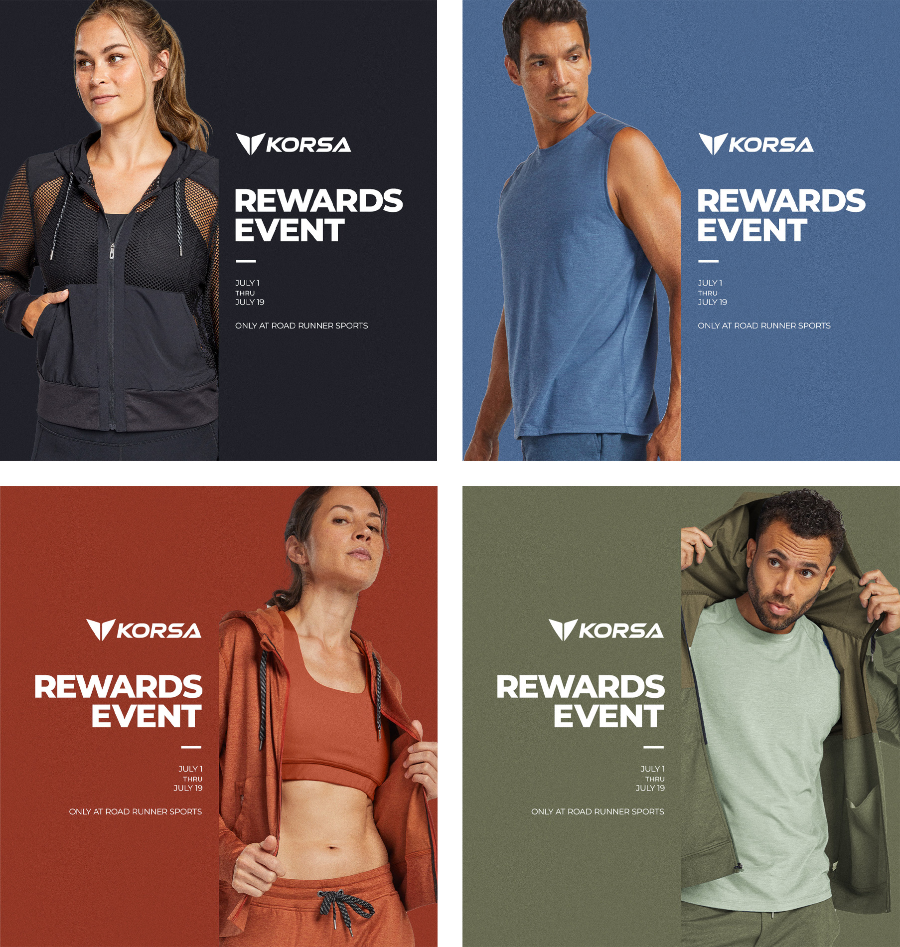
Colors of Korsa
Sign toppers and package inserts from Korsa
These came from a period where the colors and the playful elements from the Road Runner Sports style were being stripped away. Stores lost the orange, green, and blue walls for simple white walls. Presentations were stripped back in favor of more direct and informational signs. This was my attempt to get back some what had been lost.
Using the colors from seasonal Korsa releases the rack toppers, package inserts, wall posters, and other customer facing material would feature full-color, monochromatic presentations that leaned on in-studio photography to help promote the in-house apparel brand.
These were not particularly well-recieved by managers and stake holders primarily due to the lack of activity and running. While the criticism was valid and accepted, I still feel these were stronger candidates than the outdoor, lifestyle photos that ended up being used.